WINERY


Key Features:
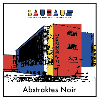
Label Design: Each wine label features striking geometric patterns, clean lines, and dynamic compositions reminiscent of Bauhaus artwork. The use of primary colors (red, blue, and yellow) highlights the minimal yet impactful aesthetic.
Typography: A strong, sans-serif font is utilized to evoke the modernist essence of Bauhaus, ensuring the labels are contemporary and easy to identify on shelves.
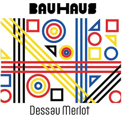
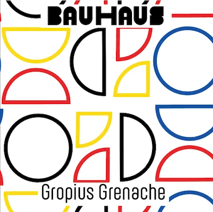
Varietals Highlighted: Custom labels were designed for specific wines, including "Weimar Malbec," "Gropius Grenache," and "Dessau Merlot," with names paying homage to key figures and locations of the Bauhaus movement.
Visual Hierarchy: The bold typographic placement and vivid backgrounds create a balance that is visually engaging while maintaining clarity and functionality.
This project involved the conceptual redesign of a vineyard’s branding and wine labels under the name Bauhaus, inspired by the influential art and design movement. The aim was to create a bold, modern identity that seamlessly merges the elegance of wine culture with the geometric precision and primary color palette characteristic of Bauhaus design.
The original branding for Bauhaus Vineyard lacked a distinctive visual identity that resonated with modern consumers and failed to stand out in the competitive wine market. The objective was to create a bold, cohesive design inspired by the Bauhaus movement, aligning the vineyard’s aesthetic with its sophisticated yet contemporary vision, while enhancing shelf appeal and brand recognition.


label iteration
This design reflects the Bauhaus legacy with intersecting lines, geometric shapes, and a vibrant primary color palette.
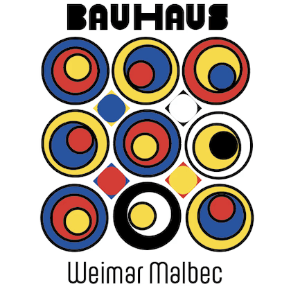
This emblem style embodies the core of Bauhaus via bold geometric shapes, elementary colors, and symmetrical layouts.
The structured composition and minimalist typography capture the elegance and modernity of the wine's character
The clean typography uplifts the modern feel, while the vibrant setup mirrors the dynamic nature of the wine.
A nearby winery named 'BAUHAUS' has been experiencing difficulty appealing to the younger audience despite their high-standard wine offerings. The contemporary brand image including its emblem, colour palette, and wrapping, appears archaic and misses to connect with the desired consumer base of 21-35 age bracket who view visual appeal and Instagram-able moments as premier considerations. The revamped branding positions 'BAUHAUS' as an ultramodern, welcoming beverage for design aficionados. The visual identity exudes an irresistible pull that aligns with the targeted age group, spurs sharing on social media, and bolsters brand recall both on a local and digital platform.
